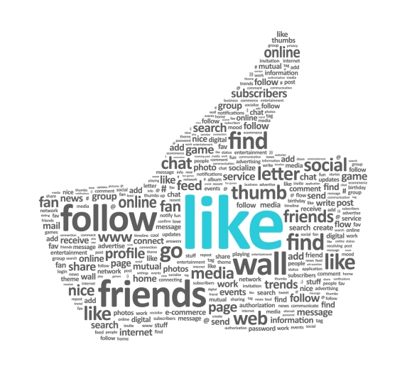
Take a jumble of words, add different shapes and sizes, some bright colors, fun font, and different directions and voilà you have a word cloud. It’s actually a little more complicated then that, but words churned out into a beautiful digital layout known as a word cloud have become the easiest and trendiest way to present a text analysis in recent years.
These clouds have a short history dating back only to the 1990’s when the first tag clouds originated. These distant cousins of the word cloud are used primarily to display the popularity of keywords in website content data and as a navigation aid. We have seen word clouds grow to become a phenomenon in recent years, thanks in large part to websites like Flickr and Wordle.
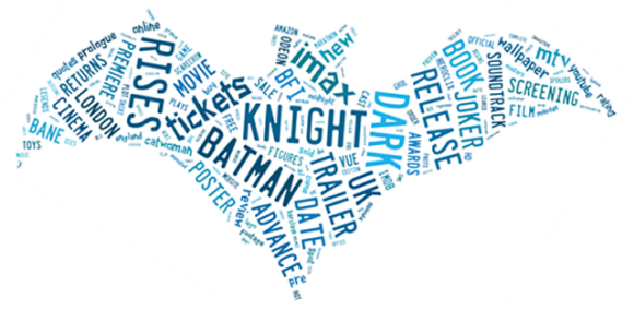
From being used as a marketing tool for various brands, teams, and products to capturing moments in pop culture and history like the Dark Knight Rises and speeches from the 2012 presidential campaign, word clouds are everywhere and can be used for almost anything.

A word cloud of most popular search terms associated with Dark Knight Rises.
Created in Tagxedo. Data sourced from Experian Hitwise.
But are word clouds here for good or merely a fad? Although, having a nice image of the most frequently used words in a document is a great visual, it only produces one dimensional data.
What if you are looking for something with a deeper meaning?
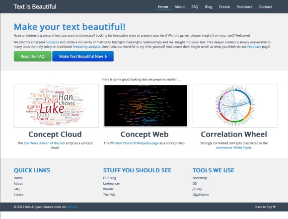
Now there is a website that offers just that. Textisbeautiful.net goes a step beyond traditional word clouds and produces concept clouds. Co-creators and software engineers, Ryan Stuart and Kris Rogers, wanted to use their skills for a more in-depth analysis of text. What started out as a pet project for its creators, textisbeautiful.net has become so popular it has been a wonderful challenge for Stuart and Rogers to keep up with the demand, which implies that this trend is far from over. Being able to identify concepts within a group of text has expanded popular interest and suggests that we are only beginning to pioneer the next frontier of text analysis.
This month Collaborative Services is turning our interest in communications from how we speak to the words we say. With so many places to start we wanted to see what was on the horizon for words and their meanings. We spoke with textisbeautiful.net co-creator Ryan Stuart to find out more about concept clouds, where he thinks textisbeautiful.net is headed next, and why he thinks text is beautiful. We welcome his insights.
– – –
Word clouds have become increasingly popular over the past few years. Why has there been such mass appeal?
Social media has turned vast amounts of people into media producers, not just consumers. People are pushing out vast amounts of content to the digital world via social media in a wide range of forms including text and images. Because of this, people are constantly on the lookout for content they can produce that communicates their message which is what visualizations like word clouds provide. Couple this with advancements in both web and text analytics technology that enables sites such as textisbeautiful.net and wordle.net to visualize large volumes of text succinctly and quickly and I think you have identified one of the major reasons why word clouds have become so popular. Word clouds are the simplest and most intuitive way of visualizing text data, plus they are easy to share.
Your website produces concept clouds instead of word clouds. What is the difference? What type of qualitative analysis does Text is Beautiful perform on the text submitted through your website?
Word clouds are traditionally based on the frequency of occurrence of particular words in the text, but frequency is one dimensional. We believe that a single word and its frequency does not give the whole picture.
People communicate in concepts – clusters of words on a topic and often interchange words to mean the same thing, e.g. Dog, Hound, Beast, Animal and associate different descriptors to it. And the relationship and influence of these concepts on one another can be as important as the frequency of occurrence. Hence the Concept Cloud (and Web) – it is based on clusters of words on a topic (a concept) and their relative proximities indicates their respective connectedness and relationship. It is a more intelligent word cloud.
What has been the biggest challenge you encountered with the Text is Beautiful website so far?
The popularity of the site. It was originally made and maintained in our spare time (although that is set to change). The response has been amazing; we get 100 new people visiting every day plus an ever increasing amount of returning visitors. So, we struggle to keep up with the email traffic sometimes!
Why does your website require a 5,000 character minimum? Do you find that requiring a minimum of 5,000 character helps with the analysis?
It is an arbitrary limit, but the principle is that if the volume of text is small then you don’t need a word cloud to interpret it for you automatically – you can simply read it yourself! Technology comes in to play to achieve scalability over large volumes of text. And ‘yes’ to get a meaningful summary of a passage of text, you need a reasonable volume of information to summarise.
You and the co-creator of Text is Beautiful, Kris Rogers are software engineers by trade. Why did you become interested in using your software engineering skills to analyze text?
We had been interested in data visualisation with regard to text since university and had liked Wordle but thought it could be taken a step further. Quantitative (numeric) data analytics has been around for a long time, but text analysis is a newer and burgeoning environment, largely due to the ascendancy of social media. Text is not linear like numbers – it is an amorphous n-dimensional mass with room for innovation in its analysis and visualisation. We find it a great challenge to take such an environment and ‘convert’ or de-mistify it into a simplistic picture that can be digested by non-experts. Plus, I hate reading books and manuals, so this is a great short-cut for me!
Your website provides three ways to identify and analyze text, the concept cloud, concept web, and correlation wheel. What are the differences between the three and are some more effective for different types of text?
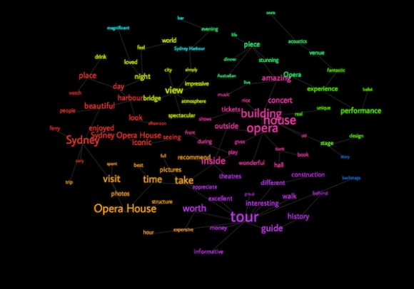
The Concept Cloud is really like art – arguably the best looking but has the least amount of semantic information as it is frequency and theme only. The Correlation Wheel is intended to interrogate the most prominent concept relationships interactively and is also organized into themes. The Concept Web is the full-metal-jacket: concept frequency, theme and relationship with all other concepts. It is our preferred visualization and hugely informative, but it isn’t for everyone.

A concept web for reviews of the Sydney Opera House on TripAdvisor shown on textisbeautiful.net
(Credit: Text is Beautiful)
Why do you consider text beautiful?
In our minds, it is a question not a statement. We are taking an amorphous mass and condensing it into different meaningful visualizations or patterns that are intended to stimulate the end-user and help prompt them to ‘see’ the meaning or beauty contained within the text that has been inspired by the author. The proof is in the pudding!
What’s next for your website? What are your goals for the next year?
This is a first-cut endeavor at interpreting and visualizing text. We already have more advanced ways of distilling the content in process in our “Lab” and additional visualizations. We would like to deliver this with some further analytical features and improve the ways that we can share the outputs, i.e. social integration. We want textisbeautiful.net to bring meaningful text analytics to the masses in a simple, visually compelling and intuitive way. Watch this space!
– – –
Next time you are looking for a new and visually pleasing way to analyze your text, try out textisbeautiful.net and see if a concept cloud, concept web, or correlation wheel works best for you.
Liz Faris, Associate
Collaborative Services, Inc.


Recent Comments